Tiger Skate club describes themselves as
“Women & girls-based skateboarding club all about having fun in a comfortable and safe environment. No limits to getting rad”. For this project our goal was to create a website for them, and here is the process we on how we did it!
Their Mission
We are a community that uplifts girls, women, and gender-diverse skaters in a space that has traditionally been male-dominated. Our goal is to create a safe, supportive environment where all skaters—regardless of age or skill level—can learn, grow, and thrive.
Through seasonal meet-ups and skill-building sessions, we foster confidence, connection, and empowerment on and off the board.
Who They Welcome
Our club is open to:
Girls, women, trans, and non-binary skaters of all ages and abilities
Anyone who is passionate about skating and committed to creating an inclusive, respectful, and empowering community for gender minorities
Whether you’re stepping on a board for the first time or perfecting advanced tricks, you belong here.


started with a persona
This is Donica
(12 years old, in grade 7)
She enjoys staying active by playing soccer with her brothers, and likes to spend most of her time outside. She is interested in joining the soccer team at school but due to covid many recreational activities have been cancelled›. She thinks skateboarding looks cool but is a little nervous of practicing at skate parks alone. Not many of her friends are as curious about skateboarding and she wants to meet new people outside of her school.
The UX/UI
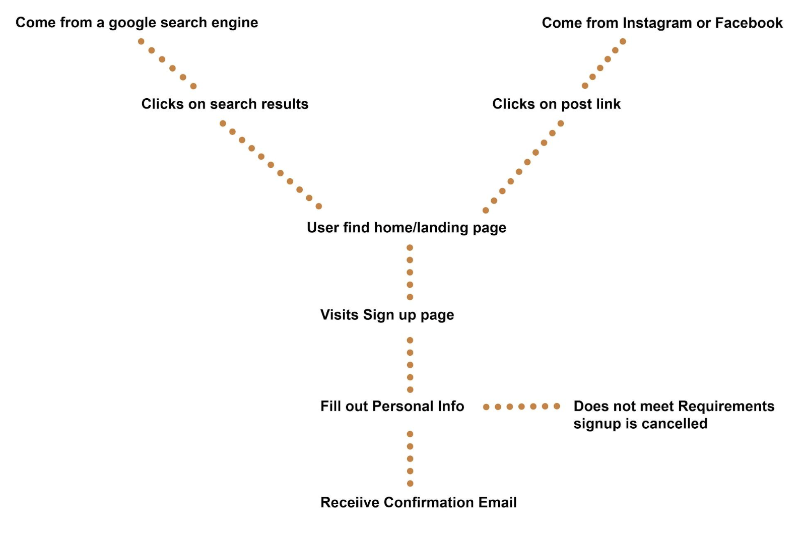
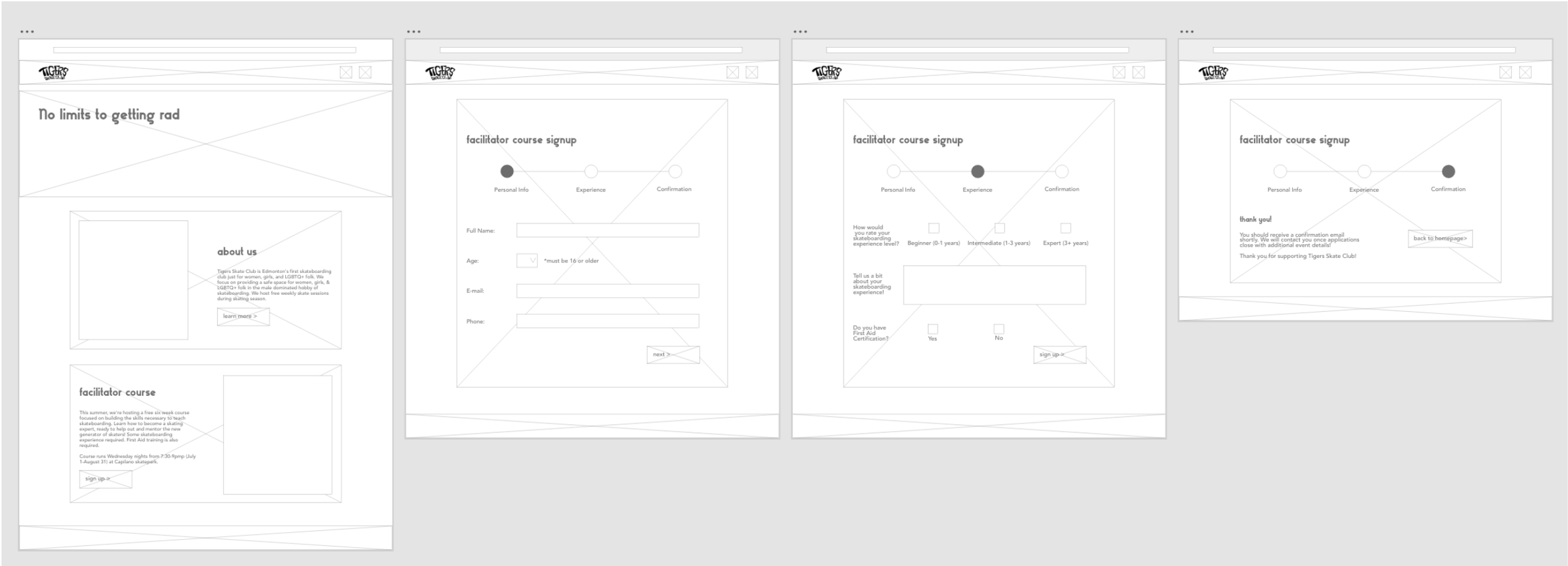
We carefully studied the flow of the user experience before diving into branding. Our priority was to ensure that the application process was intuitive, straightforward, and easy to use. We also optimized the user journey so that applying through their main channels—such as Instagram or Facebook—would seamlessly connect to the website we were building.


Branding
Tiger Skate Club is a bold, empowering brand built for girls, women, and gender-diverse skaters of all ages and skill levels. Our goal was to capture the spirit of a playful, punk-inspired skate community that thrives in a traditionally male-dominated space.
The branding leans into vibrant orange tones, energetic typography, and hand-drawn, gritty illustrations that reflect the rebellious, fun-loving nature of the club. Every element—color, type, and art style—works together to convey confidence, creativity, and inclusivity.
We wanted the brand to feel approachable yet fearless, playful yet powerful—just like the skaters it represents. The visual identity connects seamlessly across channels, making the club’s message of empowerment, community, and skill-building instantly recognizable.

